Catching up on articles 2
Table of contents:
- Missing the Forrest for Usability — Testing!
- How Good Design Can Transform User Adoption Rates for SaaS Apps
- Unlocking the power of an inclusive classroom with Figma’s open canvas
- Lessons \& takeaways
Missing the Forrest for Usability — Testing!
- Free post 👍
- Essential reading score: 2/5
TL;DR Don’t forget to find out if people actually want your product. Obvious but all to common problem.
You may want to read it if you’re new to the field and trying to consume everything UX. But my TL;DR summary literally communicates what the article says.
Evaluative research should walk side by side with every maturity of our idea towards being a product
How Good Design Can Transform User Adoption Rates for SaaS Apps
- Free post 👍
- Essential reading score: 3/5
49% of workers in the U.S. would leave their jobs out of sheer tech frustration?
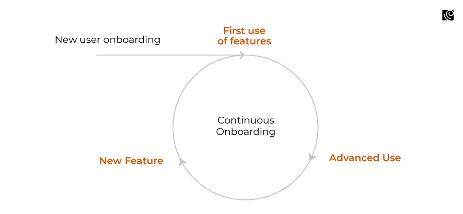
Continuous onboarding Something I’ve thought about for a while. Giving your user everything during onboarding is a recipe for missed features and a continuous free member tier user. Think about how you can restrict features during onboarding and drip-feed them the your user at the right time.
 Circular diagram, showing the user journey from first use to advanced use to new features. Image from article
Continuous user onboarding is the practice of consistently guiding users beyond their initial interaction with the software.
Mehta gives a great example with Trello:
Trello pushes helpful hints or showcases less-known features directly within the platform. This serves as bite-sized, digestible knowledge reinforcement.
Streamline Your App’s Navigation and Information Architecture We’ve all worked on a product where the user has to jump around to complete specific tasks, referring to the navigation to access the next step in their workflow. Mehta discusses streamlining the workflow, reducing the friction for the user, from having to jump around the product to achieve their task.
Understanding the user’s journey from start to finish is paramount
This is something worth fighting for within your product. As the product develops, it becomes harder to fix the journey when features are built upon an imperfect user journey.
But it’s not always straightforward to understand the user journey from start to finish. Some users’ tasks don’t allow for a straightforward journey and some organisations can’t get time with their users and have to make assumptions. Mehta’s advice on using familiar navigation patterns and customisable dashboards is perfect if your user’s journey isn’t straightforward.
The article then goes on to talk about a few obvious points, like responsive design, consistency and the tricky subject of personalisation. I say these are obvious, not because they are found in every product. But if you are a designer in product, you are likely fighting to implement them.
Design should be involved in the strategy of product development, if that were the case, there might not be a problem refactoring things like inconsistent components, desktop-only designs and one-size-fits-all home screens for every user type.
That one took a little longer than I planned
Unlocking the power of an inclusive classroom with Figma’s open canvas
- Free post 👍
- Essential reading score: 2.5
TL;DR Good read for me but not something all designers need to read at all. It’s just a case study of how Figma and Figjam is being used in the classrooms.
This is catered to me because I have a strong interest in education. I’m one of the kids who fell through the cracks of the education system. Having a child at sixteen meant I got to experience education again through my daughter.
In recent years I got diagnosed with ADHD & dyslexia and found ways to re-educate myself. I am passionate about creative forms of education and leaving the one-size-fits-all approach in the past.
##### creating an image bank instead of a word bank for a child struggling with literacy, including audio clips for a student with low vision, and hiding parts of a lesson for kids working on executive functioning
Hearing the creative ways Figma is being adopted in the classroom gives me hope. I was worried about children without computers, which is still an issue, I’m sure. But I hadn’t thought about the Figjam being used as the whiteboard for reference in practical lessons.
It was nice to read that Google for Education and Figma are partnering through Chromebook. Hopefully that’s an initiative that will help children without laptops. And expands further than the US and Japan.

Key takeaways from the article:
- Designing lesson plans in Figjam
- Using Figjam to Improve the experience of children with disabilities
- A drive for a more holistic approach to adolescent development
- Universal Design for Learning (UDL)
- 5E Instructional Model
- Project-based learning
- Inclusive classrooms
- Google for Education and Figma / FigJam partnership
P.S. Using the Natural Reader Chrome plugin with the Figma blog was a little annoying. Natural Reader is a text reader I use often. It would read the call-out text twice. I’m not sure if that’s a problem using standard screen readers or an instance of unnecessary Aria labelling 🤷🏻♂️.
I’ve noticed this happens on Medium if the alt text of an image says the same thing as the caption. Something to think about when creating content for blogs and products. Little UX note there
Lessons & takeaways
Nothing incredibly insightful today. Just the basics.
- Make sure the thing you’re building is something people actually want and would care about before getting bogged down in design & usability testing.
- Fight for good UX practices wherever you work. It’s better to take time laying solid foundations than retrofitting good UX into a cobbled-together stack of features.
- Design tools are great for learning. Not just the software, which is definitely useful for creative learning experiences. But Human Centred Design is something that should be applied to the whole education system. Design a better tomorrow, today. (I couldn’t help but write that corny tagline to end on.) ✌️